Beskrivning
This is a simple parallax image plugin that uses the parallax.js script by pixelcog – http://pixelcog.github.io/parallax.js/
To insert your full width parallax image, simply use the [dd-parallax] shortcode. Include text to be overlaid on the parallax between the open and close [/dd-parallax] code. This plugin has been tested with WordPress 2014, 2015, 2016, and 2017 themes as well as a few themes that use Bootstrap. I can’t guarantee that it will work with all themes, but it’s worth a shot.
** Please note for WP 5.0 **
Currently this plugin works, but the TinyMCE button only works with the classic editor. A Gutenberg widget is in the works.
For example:
[dd-parallax img="imagename.jpg" height="600" speed="3" z-index="-100" mobile="mobile-image.jpg" offset="true"]

Text to be overlaid on the paralllax window

[/dd-parallax]
Available parameters for use:
- img – use the filename from the media library for this, not the full path. Just use imagename.jpg or image.png. (You can also use a fully qualified URL)
- height – This is the height of the parallax window. The unit is in pixels. Just enter a number
- speed [optional] (default = 2) An integer between 0 and 10. The speed at which the parallax effect runs. 0 means the image will appear fixed in place, and 10 the image will flow at the same speed as the page content.
- z-index [optional] (default = 0) – The z-index value of the fixed-position elements. By default these will be behind everything else on the page.
- mobile [optional] – If you want a mobile fixed image for mobile display, choose a different image, otherwise it will select the full sized image from the parallax and make it a responsive image.
- offset [default = false] (options: ”true” or ”false”) – This will pull the parallax content all the way to the left of your screen. You can put the contents into a ”container” class if you’re using bootstrap or just center the contents for horizontal centering. On testing with the WordPress 2016 Theme, keep offset at False. With Bootstrap Themes, I recommend using the ”offset=’true'” parameter.
- position [optional] – (defaults to ’Left’) This is analogous to the background-position-x css property. Specify coordinates as right, left, center, or pixel values (e.g. -10px 0px). The parallax image will be positioned as close to these values as possible while still covering the target element.
- text-pos [optional] – Default is ’top’ (to maintain compatibility with ver 1.6). Available options are ”top”, ”center”, ”bottom”.
Admin-Settings page enables or disables the TinyMCE icon (if you don’t want it in your WP-Editor)
Demo
View a demo of this plugin here
Skärmdumpar

The shortcode implemented with the WordPress Twenty-Sixteen Theme 
Editor view of shortcode usage. 
A Parallax Window on a bootstrap theme with fullwidth template. 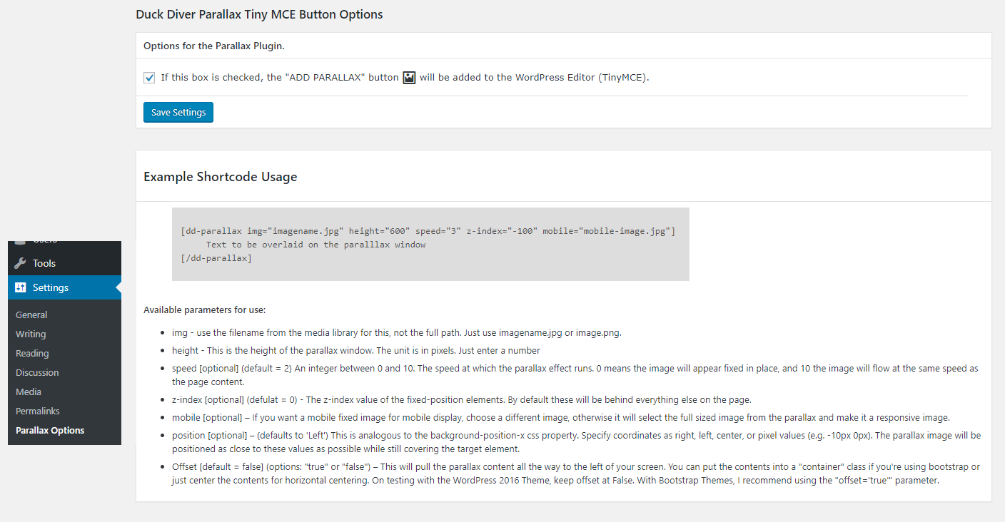
Installation
- Upload the plugin files to the
/wp-content/plugins/parallax-imagedirectory, or install the plugin through the WordPress plugins screen directly. - Activate the plugin through the ’Plugins’ screen in WordPress.
Vanliga frågor
-
I’m not seeing the image on the screen, what did I do wrong?
-
For this – there are 2 probable reasons that you’re not seeing the parallax.
* First – Check to make sure that your img is only the file name, and not the full path. If you view the media library in ”list” mode yourdomain.com/wp-admin/upload.php?mode=list – there you’ll see the filename with the .jpg or .png extension.
* Second – If not the first answer. Check your z-index. Changing the z-index will adjust the layering of your screen with CSS, and may need to be changed depending on how your theme displays the backgrounds and colors. For more about z-index – w3schools -
Can I have multiple parallax images on each page.
-
Yes
-
Will this work on mobile devices
-
For mobile devices, you can either have a totally separate mobile image by using the ‘mobile’ parameter in the shortcode, or you can just have the main parallax image resize itself and be responsive.
-
While I’m debugging, the mobile test doesn’t look right
-
If you’re resizing your browser window to check for responsiveness, the plugin uses mobile_detect, so you must either spoof your user agent, or test on a real mobile device. You might have to refresh for it to work right.
Recensioner
Bidragsgivare och utvecklare
”Parallax Image” är programvara med öppen källkod. Följande personer har bidragit till detta tillägg.
Bidragande personer
Översätt ”Parallax Image” till ditt språk.
Intresserad av programutveckling?
Läs programkoden, kika på SVN-filförvaret eller prenumerera på utvecklarloggen via RSS.
Ändringslogg
1.7.1
Add check of existence for offset js
1.7
Updated to work with Twenty Nineteen. Added ability to position overlay text top, center, or bottom.
1.6
Updated Parallax.js source script to version 1.5 fixes some flickering when placed close to other objects.
1.5
Add TinyMCE button and options under settings menu
1.4
Fix for mobile image from external URL.
1.3
Added shortcode attribute ”offset” to pull contents of Parallax Contents (text overlays) to the left.
1.2.1
Add ability to specify img source outside of media library or use full URL.
1.2
Added mobile_detect and mobile options to make the image responsive for mobile display and render better on mobile. Added ’mobile’ parameter to the shortcode as an option.
1.1.1
Added a Space to the style block to correct
1.1
Fixed Error
1.0.2
Removed extra js to keep lightweight
1.0.1
- Update Plugin URI
1.0
- Initial Release Version